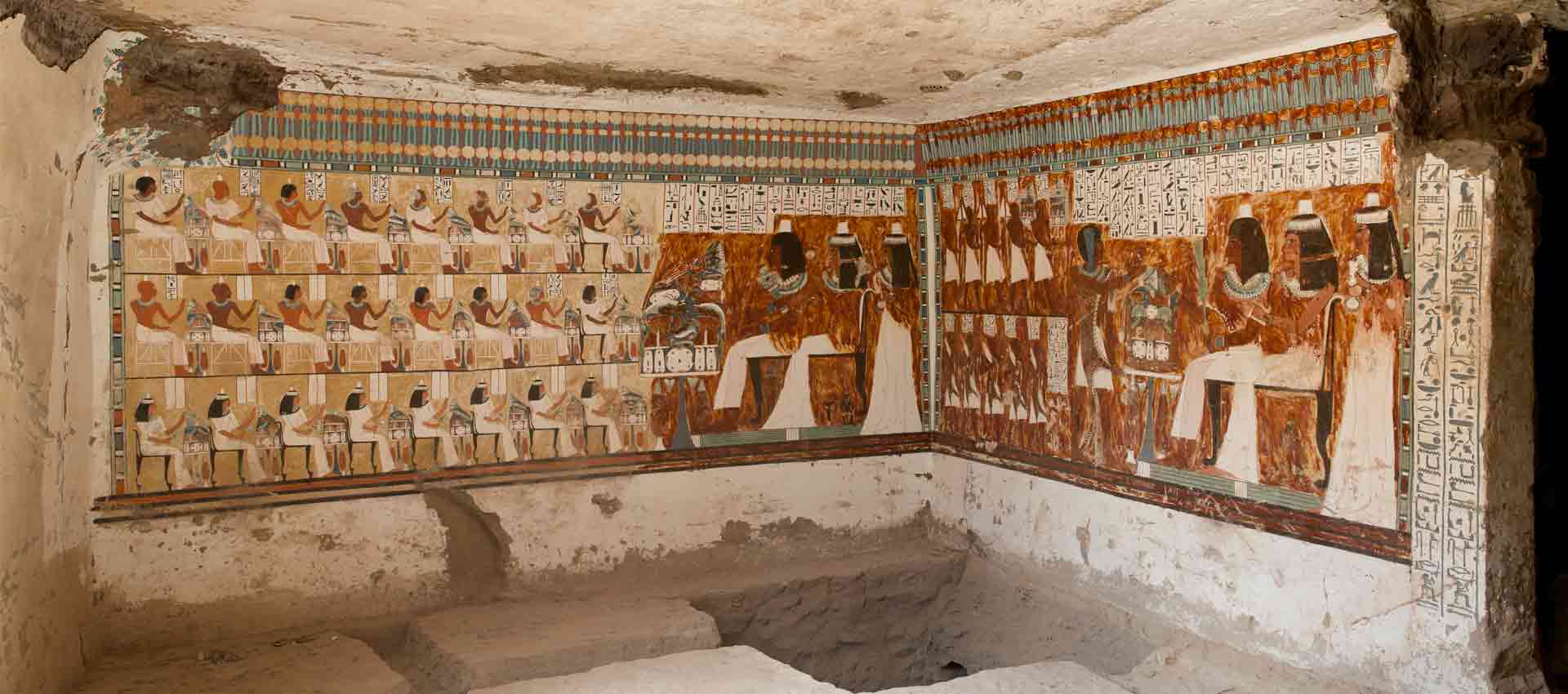
We all see it every day; it is everywhere, and yet hardly anyone pays it any attention: we are talking about type. Christian Mathieu of the Berlin State Library and Michael Lailach of the Art Library want to change that and – partly because they work in institutions dedicated to written heritage – are very active in the field of typography. Having previously focused on Berlin’s typographic heritage at a regional level through the project ‘Die Sichtbarmachung des Sichtbaren’ (Making the Visible Visible), in collaboration with the State Library, the Art Library, the German Museum of Technology Foundation and Erik Spiekermann, the aim now is nothing less than the creation of a national typographic archive – digitally and in open access, of course, funded by the German Research Foundation and in cooperation with the German National Library as well as Nikolaus Weichselbaumer from Johannes Gutenberg University Mainz. The project is based on around 7,000 type specimen books from the years 1820 to 2000, which need to be digitised. We have some questions:

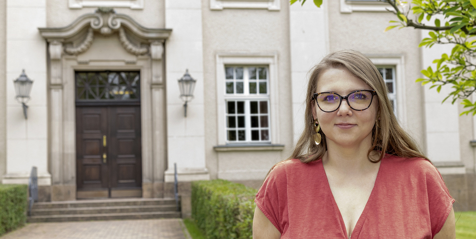
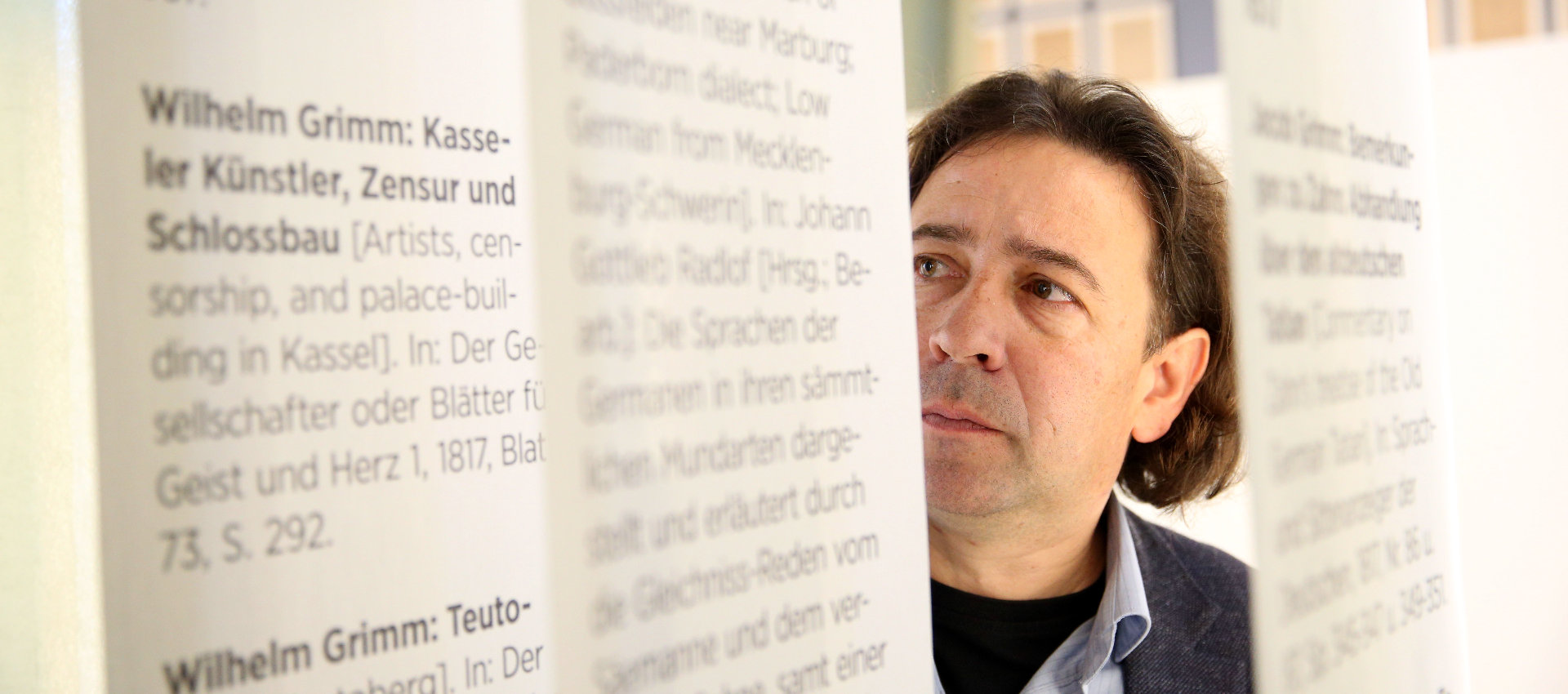
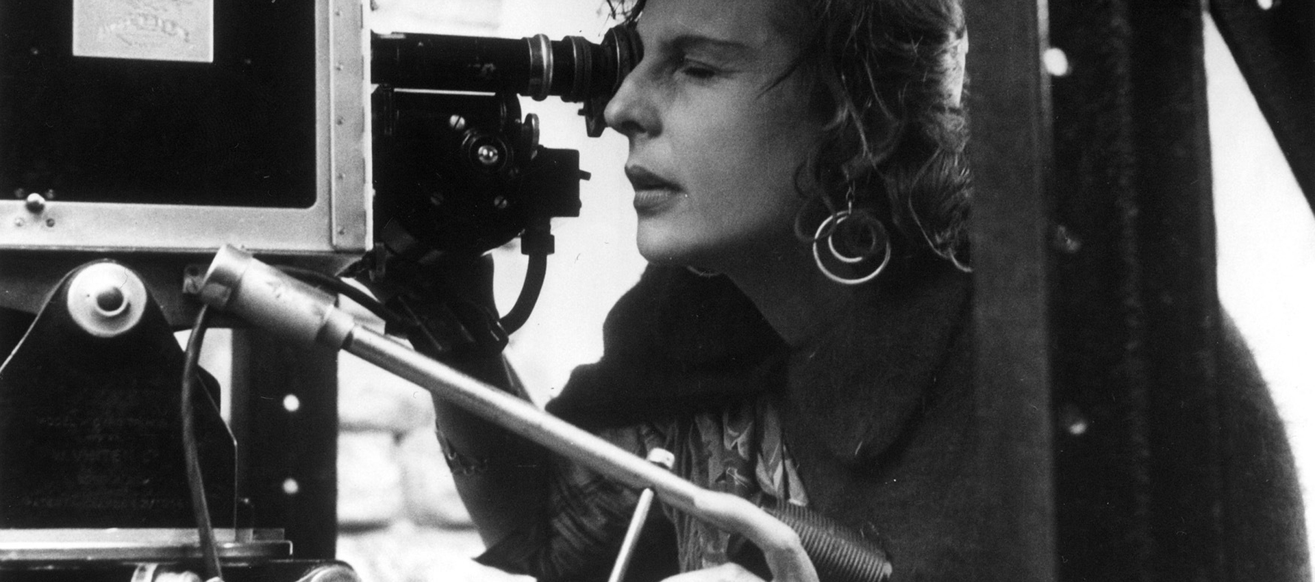
Dr Christian Mathieu is a research officer at the General Directorate of the Berlin State Library (SBB)
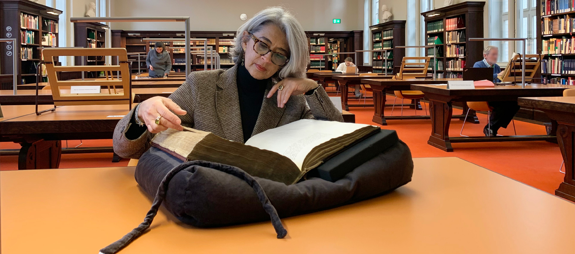
Photo: SPK/Jonas Dehn
How did the project actually come about, and what is its aim?
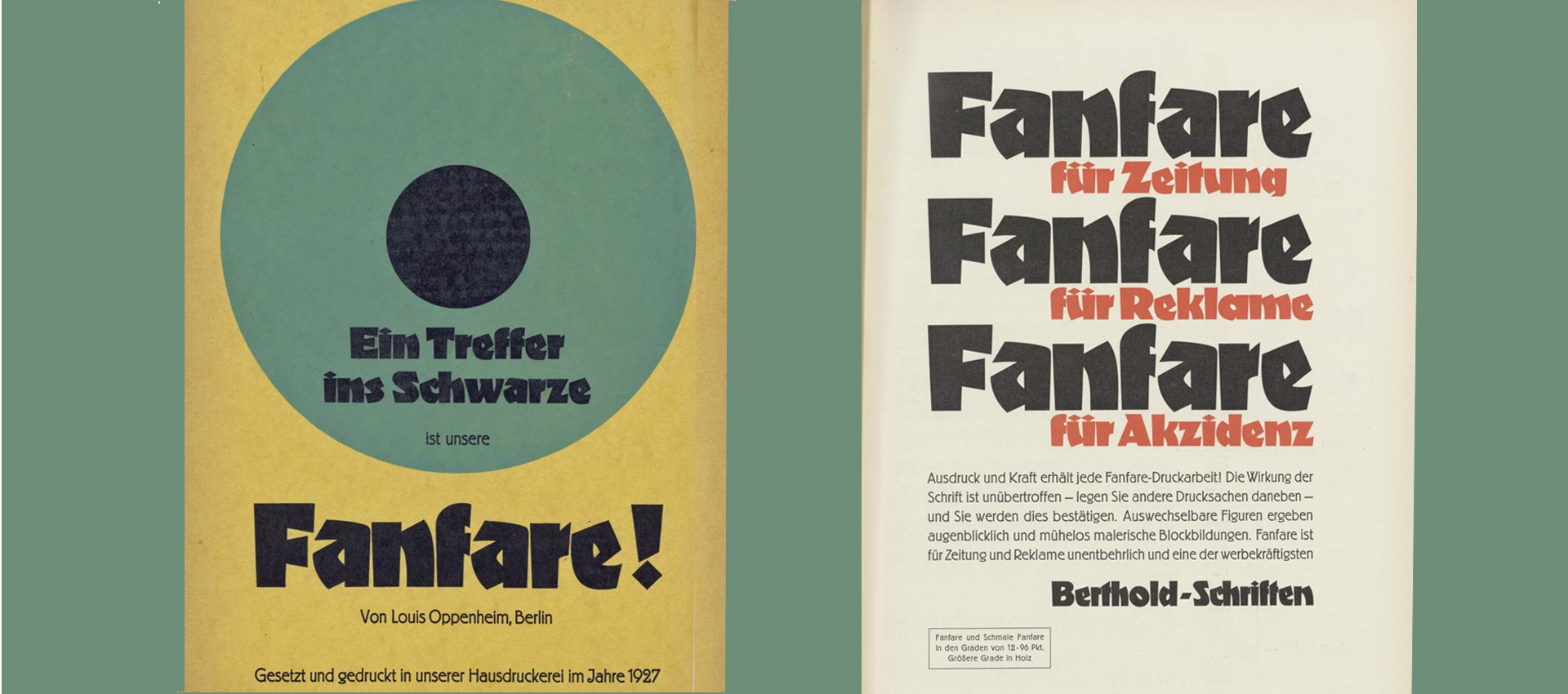
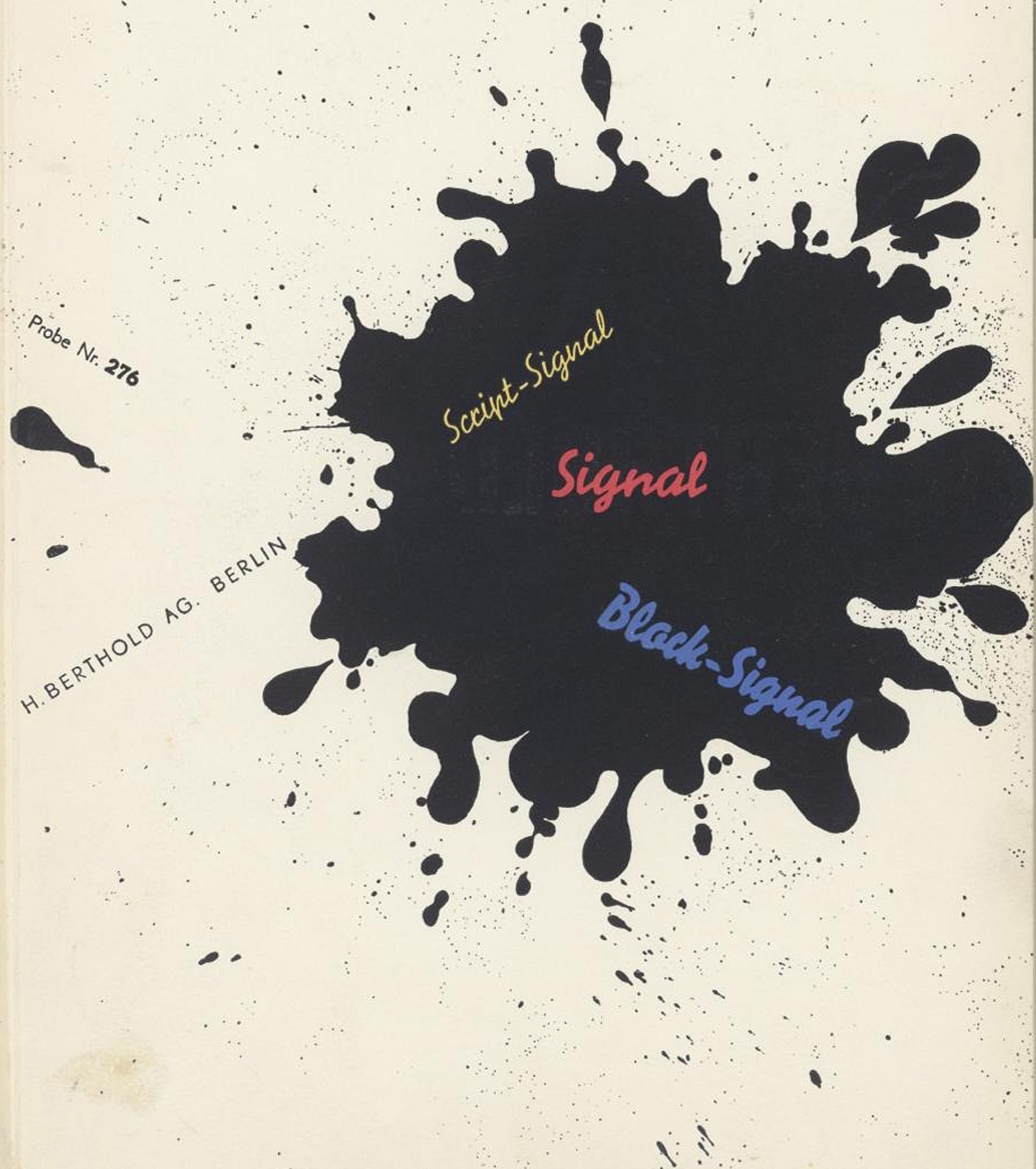
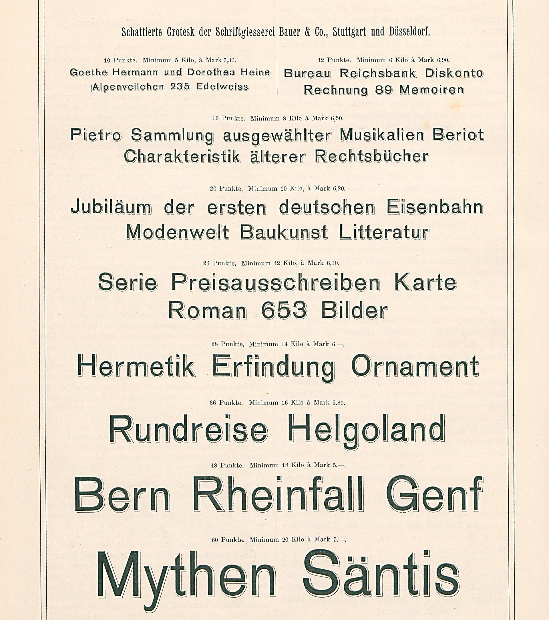
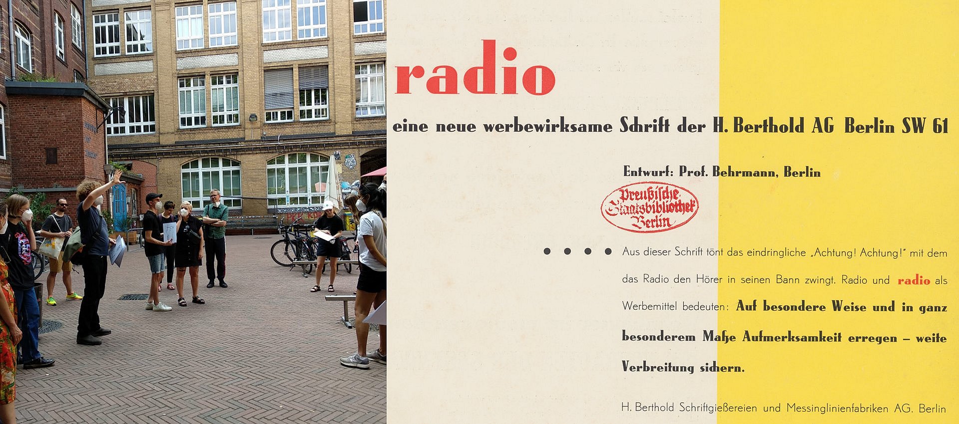
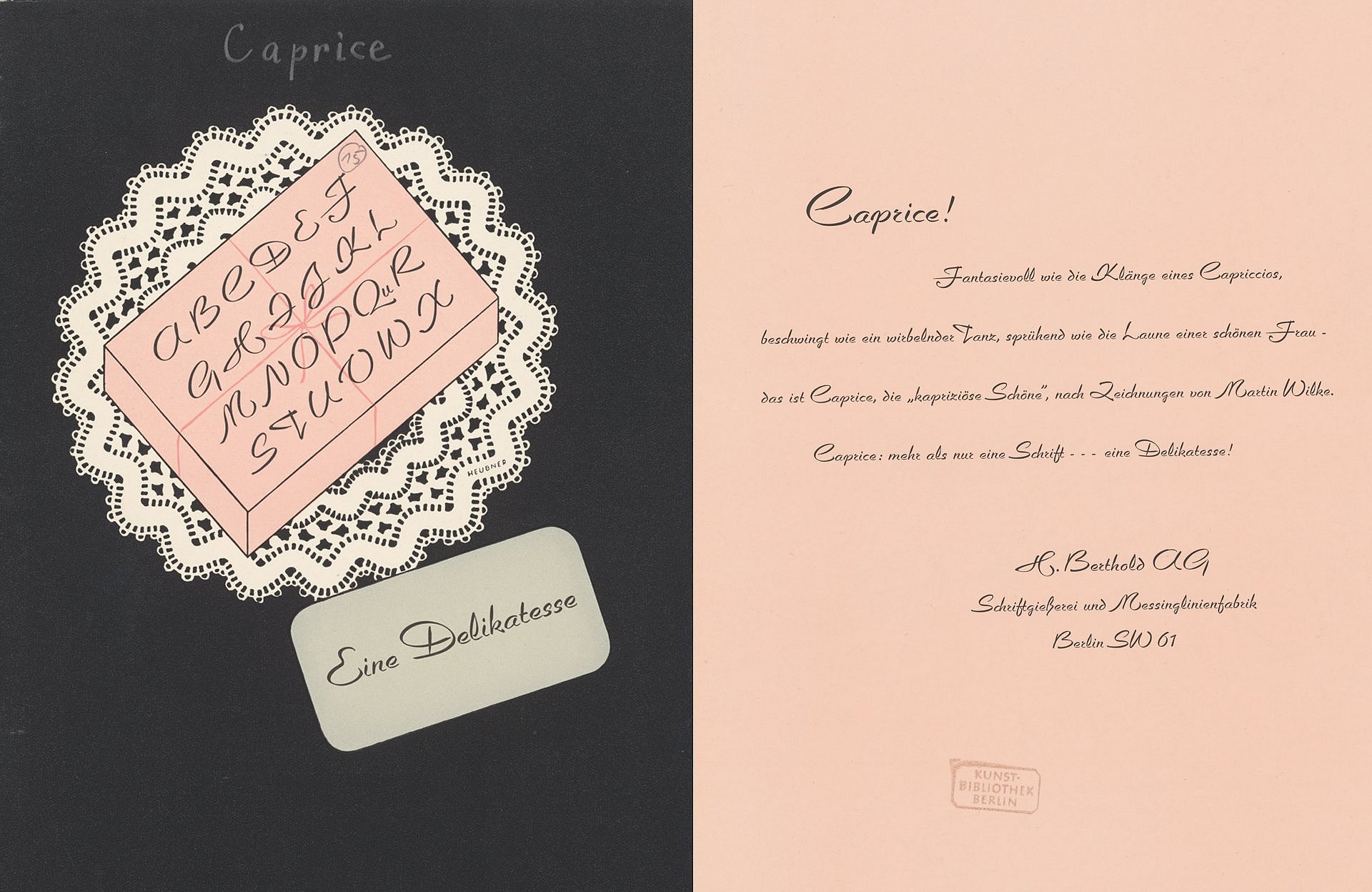
Mathieu: With the dawn of the industrial age, people began to showcase typefaces with evocative brand names designed to convey the character of the typeface. A name like “Caprice” or “Comteß-Lola” immediately conjures up an image of how the typeface looks. Other examples with rather gruesome connotations would be “Wotan” or “Tannenberg” from the Nazi era.
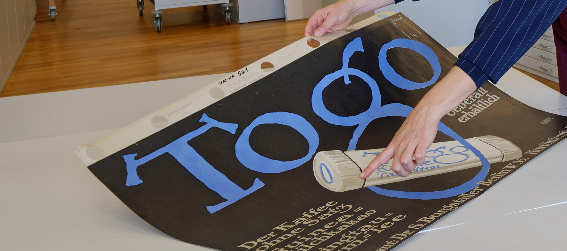
And it wasn’t just through the brand name, but also through the corresponding design of the type specimens – that is, the sample books used to promote individual typefaces or the entire type portfolio of a foundry – that people sought to demonstrate how the letters from A to Z would look. That is why they chose word sequences that corresponded precisely to the character of the typeface. And it was precisely this selection of semantically charged terms that the Berlin-based comparative literature scholar Thomas Rahn discussed in our lecture series ‘The Materiality of Writing – Library and Research in Dialogue’. This is how I became aware of this genre of type specimen books and, above all, recognised the significance they hold for research.
In the German National Library, we have managed to secure the biggest player in the field of type specimen collections in Germany for our project. And in Nikolaus Weichselbaumer, we have one of the most versatile typography historians in Germany on board. He not only conducts academic research into the genre of the type specimen book, but also seeks to harness its potential for improving automatic text recognition.
Incidentally, the history of the project also offers a glimpse into its future prospects. There is, of course, value in itself in digitising the type specimen books and, above all, in making them available in such a way that both researchers and creative professionals from the typography scene can benefit from them. In other words, type designers can further develop the digitised type samples into digital fonts. Erik Spiekermann, for example, did this as part of our preliminary project in Berlin for Berthold’s Akzidenz Grotesk – a historical typeface that can now be integrated into one’s word processing programme.
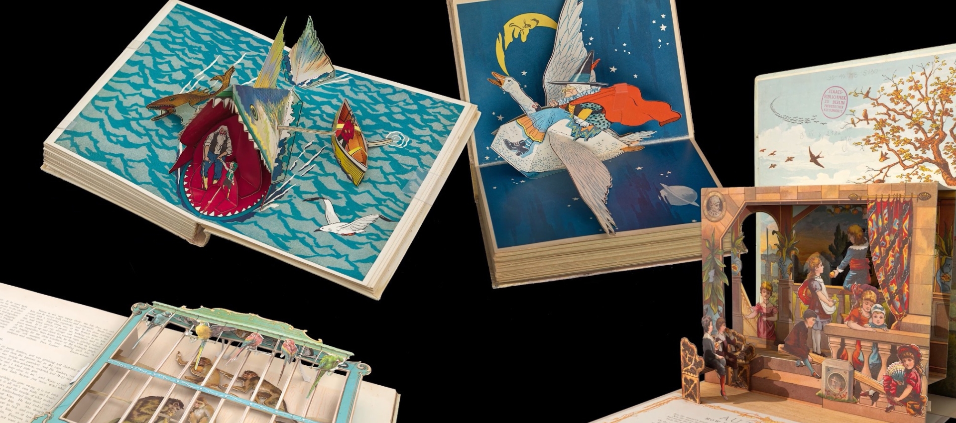
A long-term goal of our project is also to establish a kind of font search portal within the German Digital Library that documents typefaces from the German-speaking world – both those that were realised and those that remained mere designs. This is because many typeface designs were never realised; due to a lack of demand from printers and the book trade, they can only be found in the aforementioned type specimen books. Others, however, were cast as lead type, carved in wood or produced as plastic typefaces. The latter was more common when printing posters, as lead letters are quite heavy, so people tended to switch to wood or plastic.
With our project, we aim to create a national reference point where the largely overlooked cultural heritage of typography is systematically documented. When one thinks of type culture, one tends to think of printed matter such as books or posters rather than type as a value in itself. Type is so ubiquitous that one almost overlooks it. Type is everywhere, yet hardly anyone pays attention to it. We believe that typography is an equally important vehicle for our written cultural heritage, one that absolutely must be promoted more strongly and made more visible. And that is precisely what our planned central reference portal is intended to serve.

Dr Michael Lailach is Curator of Book and Media Art at the Art Library of the Berlin State Museums
What can be explored in typography?
Lailach: One can explore the evolution of text design. Whether we consciously reflect on it or not, text design does, after all, play a crucial role in shaping our understanding of texts. And not just of texts, but also of text-image relationships. In that respect, it is a vast field of research. A young and growing field of research, where questions are asked such as ‘What does the materiality of the book actually look like?’
It’s really all about the details. At first glance, one might think that typefaces always look the same. But in fact, there are minute differences that significantly shape our perception.
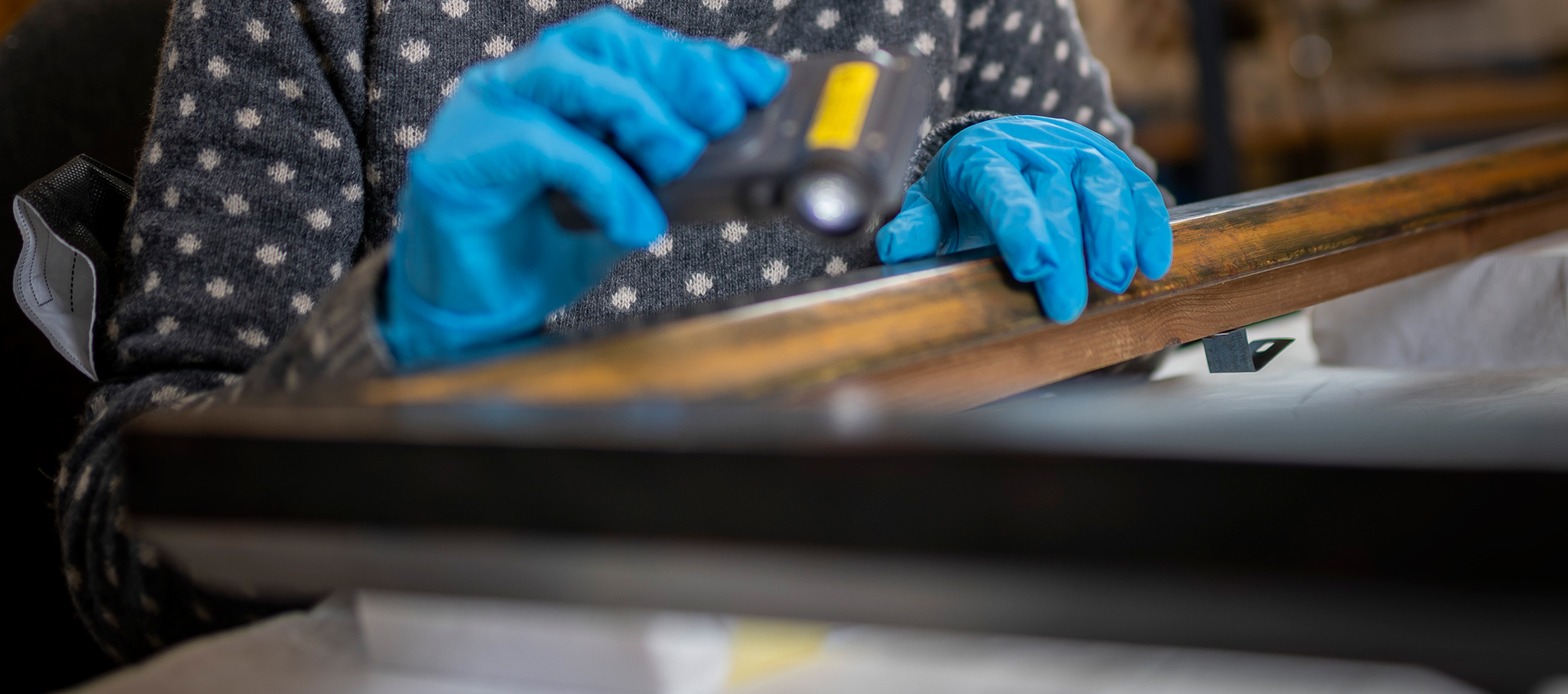
Making this particular type of text – the type specimen book – available in its entirety through digitisation, documenting it, and actually preserving its visual form to make it accessible for research is therefore highly exciting. It really is all about questions of detail, e.g. how is the letter ‘A’ designed, how large is the belly of the letter or the curve of a typeface? What is the height of the type? Really small details, but ones that have a big impact.
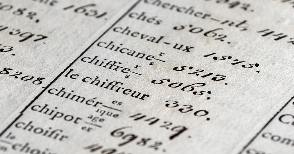
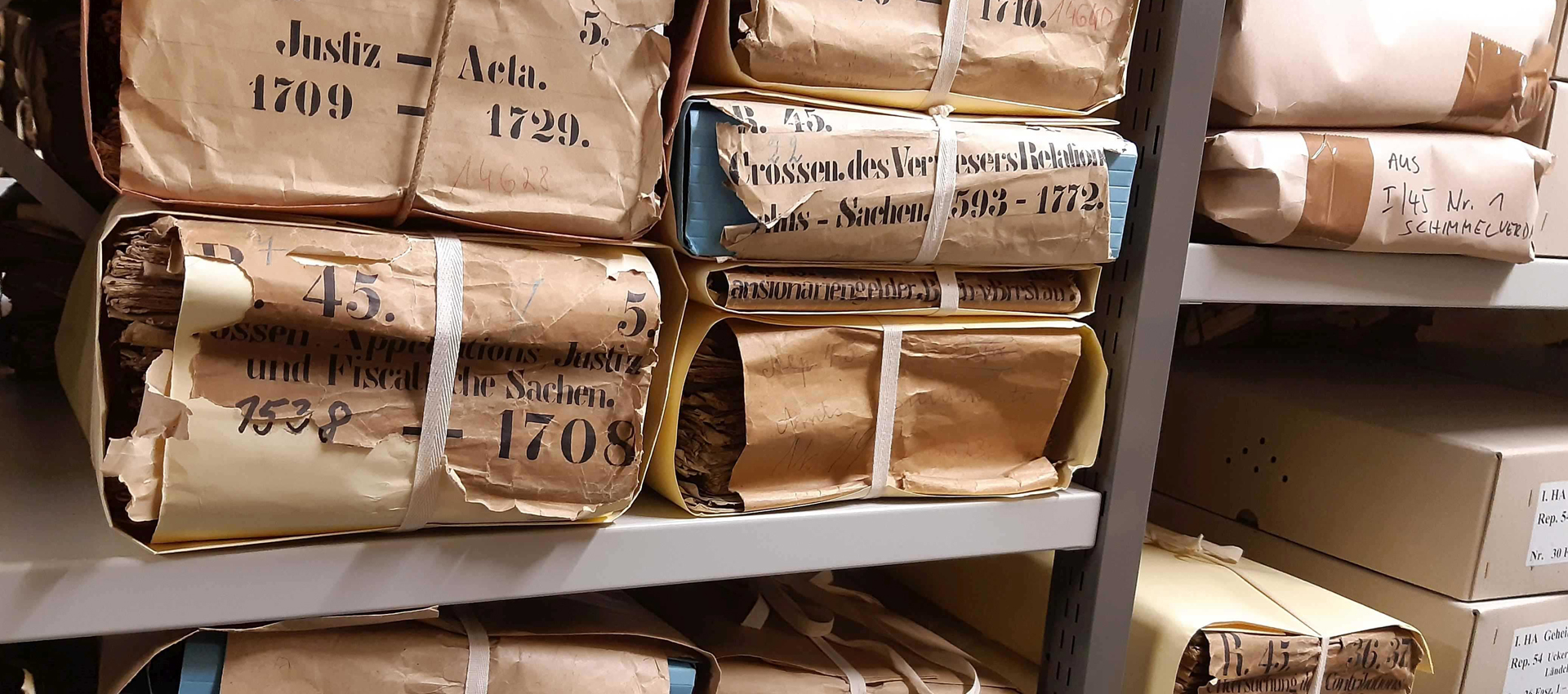
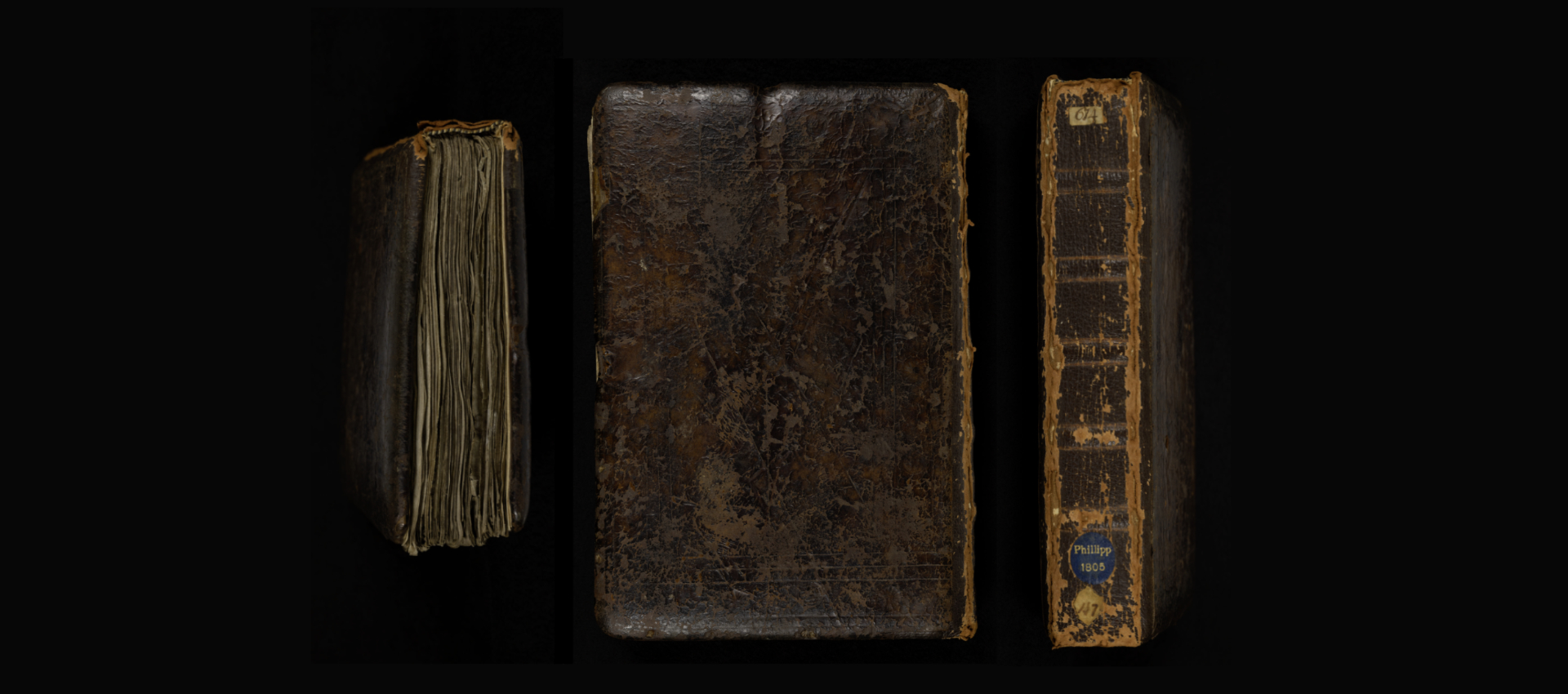
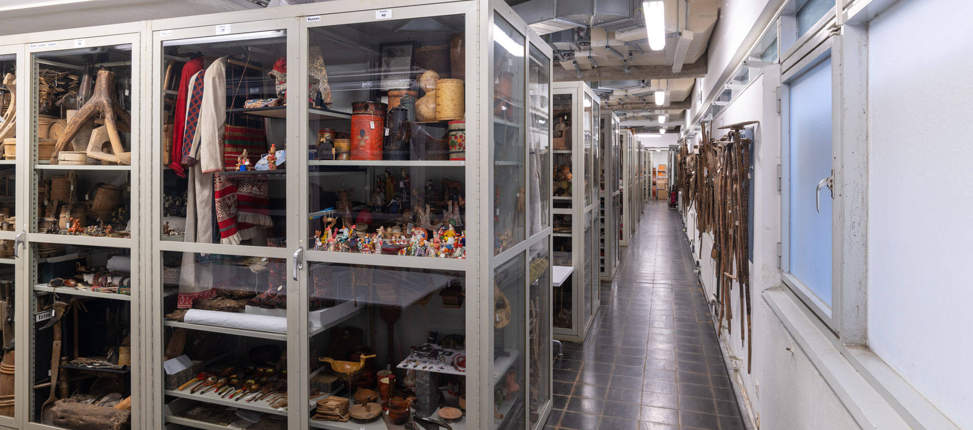
The typeface sample book genre has been difficult to find until now. Libraries do not usually have such items, as they are not books in terms of content. They never found their way into libraries via bookshops, but were predominantly donated by type foundries. In the past, this was known as ‘grey literature’, situated somewhere between corporate communications and sales catalogues. The typefaces themselves often no longer exist outside these type specimen books. And these provide a vast resource for examining this evolution of type in detail. Even today, on smartphones or tablets – type is everywhere, and the question of how type influences our perceptions remains a highly topical issue.
Mathieu: It is often said that authors do not write books; rather, they write texts which then become books through interaction with other people.
When it comes to the reception of written works, it is not just the content that matters, but also the packaging. And it is precisely this connection between the exterior and the interior of a work that textual materiality research examines; research that is interested in book design, in bindings, but also, in particular, in typefaces. Typeface shapes the perception and reception of a text.
There are studies showing that various works related to one another were also set in identical typefaces. In other words, one can perceive relationships between individual works purely visually, because in the design, an identical typeface was simply chosen to establish the reference to the other work. Many authors have tried to make very active use of this tool: Stefan George designed his own typeface for his works, and Friedrich Nietzsche was also very attuned to the impact of typography.
You’re planning an open-access platform – what about the copyright of typefaces?
Mathieu: Typefaces themselves are not subject to copyright, because after all, the letters must be clearly recognisable, which considerably restricts the scope for design and makes it difficult to achieve the level of creativity required by law. There are, of course, artistically elaborate decorative typefaces where the ornamental aspect is more prominent and which may therefore be protected by copyright. However, these are not found in our typeface samples – which, incidentally, are not protected by copyright as compositions either.
To be on the safe side, we have obtained a legal opinion, incidentally from a legal scholar with a PhD in law and art history who also collects typeface samples in his spare time.
The project description also mentioned a dialogue with the professional community – how and when does that come into play?
Mathieu: It’s curious that there has been a renaissance in type specimen books over the last few years, because even though fonts are designed digitally, they are always derived from historical designs. You’ll therefore find a shelf of historical type specimens in virtually every typography studio, as they serve as a source of inspiration for type designers. And these designers are increasingly promoting their genuinely digital typefaces using printed type specimens. That’s why our portal will also incorporate elements of citizen science, to integrate private collections and private knowledge.
We want to create a national typeface archive where everything comes together. OCR will also be used for typeface recognition, so that as soon as photographed type specimens are uploaded, it can be immediately determined whether they represent a new discovery that needs to be professionally digitised.
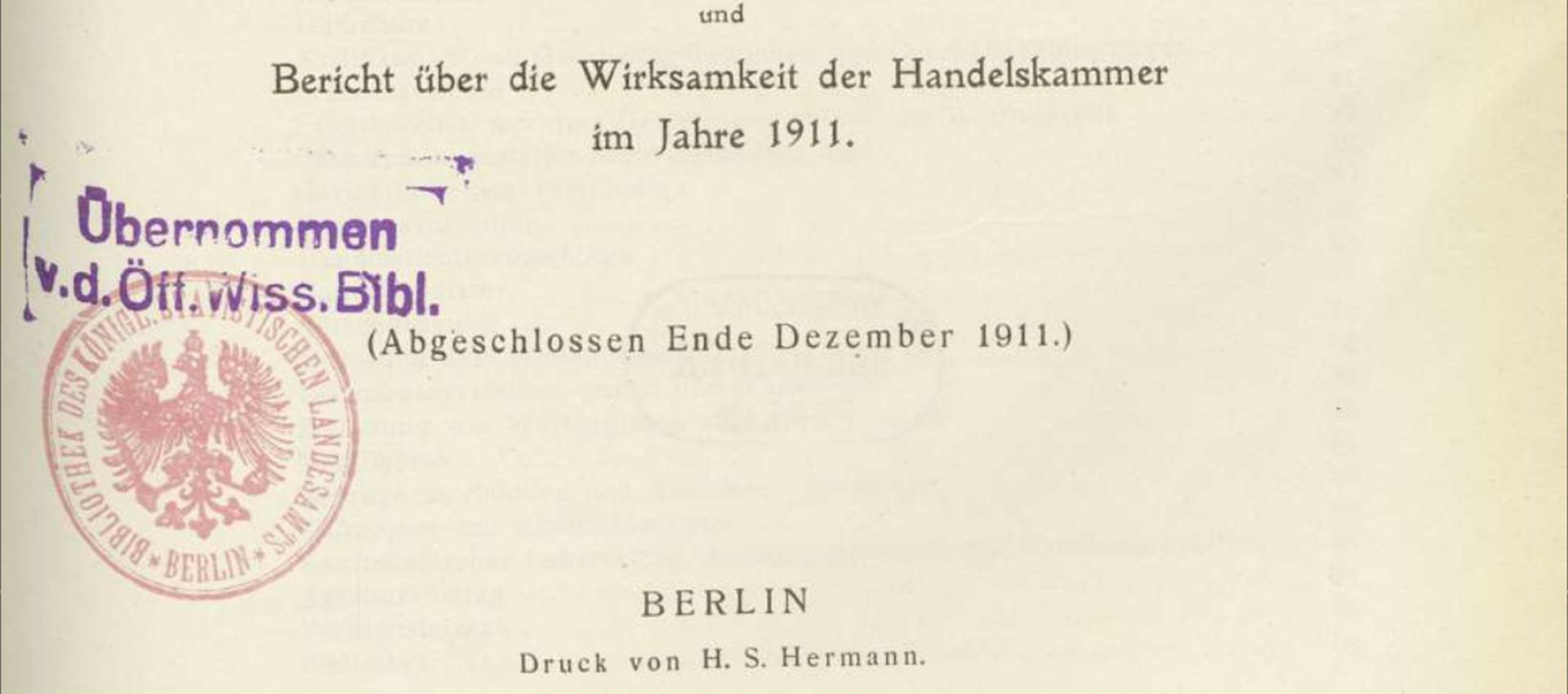
There is a typography community with a wealth of specialist knowledge, which we would naturally like to integrate into this portal. We at the Stabi have just under 700 works that we want to digitise. However, a so-called ‘main sample’, in which a type foundry showcases its entire typeface portfolio, can easily run to 1,200 pages – and each page features a different typeface. That amounts to a huge number of typefaces, which is why we also need the collective knowledge of the crowd to catalogue them.
Why is a national bibliography of handwriting samples needed?
Lailach: This project is also linked to the aim of developing standardised terms for typefaces. This is really difficult because you don’t always find terms for these typefaces in these type specimen books. Type specimen books are, after all, sales catalogues designed to show potential customers what the typefaces would look like when used to print a book or advertisements. That doesn’t mean, however, that there was a great deal of interest in the history of the typeface; it was more about selling.
Our aim of developing a terminology for identifying typefaces is indeed ambitious. And yet one can attempt this on the basis of such digitised material – even if it is no easy task.
Mathieu: That is the task of the German National Library and Nikolaus Weichselbaumer’s team within the project: the development of a typographic-historical classification system for the Gemeinsame Normdatei. This resource is used across disciplines by collection institutions to uniquely reference people, places or works, for example. Of course, there are already some initial attempts at this for typefaces, but so far they have been very heterogeneous and rather imprecise, simply because it is such a complex field. Some tidying up is needed there.
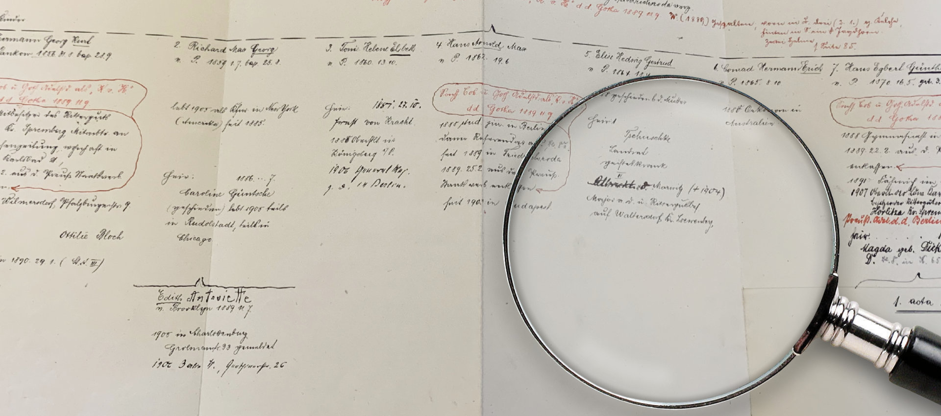
Apart from that, a national bibliography of type specimens also helps to establish identity. And so it is perhaps no wonder that the first attempt to catalogue German typefaces was made immediately after the founding of the German Empire in 1871. During the Cold War, there were also initiatives to document the typefaces produced in West Germany.
So there have been many attempts before us to tackle this Herculean task. The most recent attempt was made in 1980 by the Deutsches Museum in Munich – with the project ‘Type Founding and Die-Cutting in Germany (1871–1980)’. Such efforts were, however, doomed to failure in the pre-digital age, as there is such an immense and, moreover, widely scattered amount of material that one can really only tackle it in a reasonably realistic manner using digital methods. But we are now truly confident that, in the digital age, we have the opportunity to realise a national typographic memory. The idea is old, but its implementation is so demanding that attempts have always failed until now.
What is the situation internationally when it comes to type specimen books?
Lailach: There are type specimen books from England and France that are also absolutely brilliant, but we have very few of them in the Art Library. That’s probably also because they weren’t actually part of the book trade and so never reached us.
Nevertheless, one could of course consider whether, once the current project is finished, we should adopt a more international focus and seek partners in other countries. It would be very interesting to see, for example, what a French typeface from 1914 looks like – compared to a German typeface from 1914.
Further links
- Information on the project “Germany’s typographic heritage in the industrial age – A pilot project for the mass digitisation of historical type specimen books (1820–2000)”
- Digitised versions of the type specimen books from the State Library and the Art Library
- Podcast episode “Type Enthusiasts – The Colourful World of Type Specimens” from the “Voices of the Library” podcast
- Interview “Let’s talk about Type” on the event series “Visual Systems” (2019)
- Information on the project “Making the Visible Visible”
- Christian Mathieu in the “Hidden Gems” series